
Get that Film Look on a Digital Camera
Let’s start with the obvious. There are many film simulations out there, especially on your smart phone. If you’re looking for a quick and convenient way to snap some film pics, I’d recommend going that route. But if you want to dive deeper into your editing style, some tricks for a bit of that nostalgic or filmic look, and grow as an artist, then these thoughts are for you.

Before we get too far though, let’s define what it means to be filmic. No, you cannot replace the physics of film photography with a digital photo. What makes film photography so unique is how it works, and no app or edit is going to completely fake that process. To give you a brief understanding of how it works, film photography is essentially small crystals bursting in response to light waves. It’s a photochemical process that has been refined over the last one hundred years to give us a varying degree of film types, styles, and exposures. Nothing on a digital sensor can replace a truly chemical process.

Therefore, let’s define being filmic as having the characteristics of film. Those characteristics are typically styled by it’s colors, the intensity of it’s shadows, and (most famously) the amount of grain present in the photo.


The colors of film
A great place to start would be to figure out what kind of film you want to emulate, or if you’re truly just into a filmic style, the colors you love that you will bring alongside other elements of a filmic look. Two of the most famous film brands are Kodak and Fujifilm. Both have very different colors. A quick Google or Youtube search can show you many in-depth case studies on this topic, but just to make it really quick - Fuji tends to be cooler with vibrant greens, and Kodak tends to be warmer with more muted greens. I personally mostly shoot Kodak in my film cameras, and when I edit, I mostly edit more in the style of Kodak. But I do this with my own color shifts. If you’re a fan of the color pallet in my galleries, they’re not overly complicated. Here’s what you’re seeing.
I shift oranges towards red a little, and I shift yellow towards orange. I shift green towards yellow a little, and desaturate it, mostly. I also desaturate blue, nearly down to nothing. I don’t touch red. I also desaturate the entire image just a touch. All of this creates a color pallet that is very earthy, not overly vibrant, and warmer than it is cooler without having to change the white-balance of my photos.


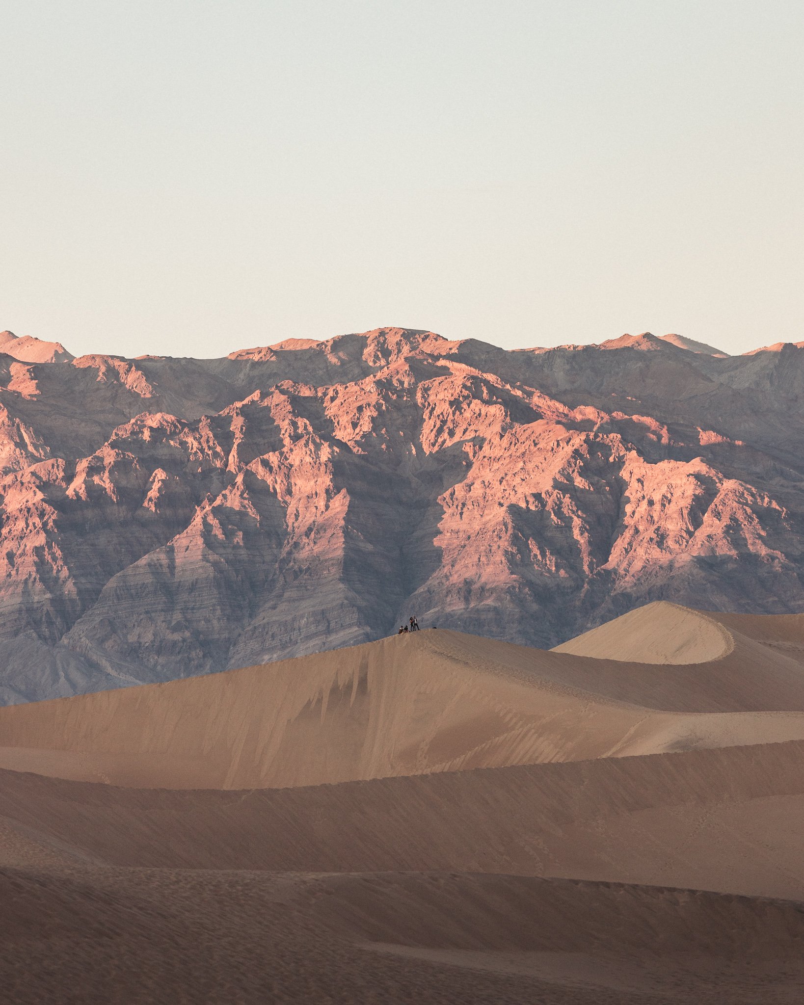
The shadows of film
Probably one of the most important parts of a filmic look is what you do with the dark places in your photos. I have two recommendations. First, fade the blacks on your curves. Here is the curve you’re seeing in most of my images. I rarely (if ever) have anything truly black. This is similar to film, as the complete ends of the light spectrum (true back and true white) aren’t as physically possible with film as it is with digital. Film typically has around 13 stops of light, where digital can have 14 or more stops. This gives digital cameras more deeper and more intense blacks and whites. So for that filmic look, chill out your blacks and whites by curving down the ends of the spectrum.

Second, consider injecting a little color into your shadows. With film, by over/under exposing, you can get some really interesting colors in the shadows (depending on the brand). These can be blue, purple, or red. In fact, check these film shots out from an old Leica R4 camera I use to have. These are straight off the film, not edited.


See how false color is injected into the shadows, giving the entire photo a different vibe? Here’s what I recommend you do. In your split-toning, slide the color of the shadows somewhere between 1-50, and crank up the saturation to taste. Try different colors. See what you’re feeling. Then, if you want to push this fade further, increase the luminance of the shadows. You can start approaching cheap/nostalgic/polaroid style shots by doing this.
The grain of film
Remember when I said that film was a bunch of tiny crystals bursting when exposed to light? This is what makes grain. When you see grain in those old film photos, you’re seeing the crystals. The smaller the crystals, the more expensive the film. Hello, Kodak Portra 400, a fine-grain film. Typically, the cheaper the film, the larger the crystals, and thus the bigger the grain. So that said, the style you’re going for will determine how you add grain to your photos. There a few different ways to add grain. You can add it in your editing workflow in Lightroom, you can add it through overlays in Photoshop, or you can add it in a app when you get it over to your phone or tablet. I just add mine in Lightroom.
I like to think my film setting is a good, middle-class film. It’s not a fine grain, but it’s not a big-crystal cheap grain, either. I typically use the following formula on 90% of photos: 30/30/50.

This grain setting is a bit more than subtle, but isn’t so overdone that it looks cheap. And when I say cheap, I’m referring to the actual cost of film - not your editing style.


But wait, there’s more!
Here are a few bonus tips and thoughts for that filmic edit. Think of these as finishing touches. They are mine, at least. First, lower your contrast a bit. Second, decrease your sharpness a little. Third, if you really want to get deep into this style, shoot at film ISO (for fun at least, or maybe there’s a practical reason). Shoot at 200, 400, 800, or 1600. Also, shoot within the limits of film cameras. My Rolleiflex gives me limited aperture and shutter options. It’s fun to work within those limits.
Last, consider using a pro-mist filter and getting a little halation onto your shots. Be very subtle with this, using a 1/8 Black Pro Mist, or a 10% Cinebloom. I have both, but prefer the Black Pro Mist. This let’s light glow out a little, something film does chemically because of fewer stops and crystals. Digital tends to be harder transitions between light.


Got any other thoughts or want to send me some tips? Shoot me a message. Follow along on my IG or Vero if you want to see my shots daily. As always, thanks for reading and following along!