

Colorizing my Grandmothers
Many years ago, I went through and started digitizing photos that belonged to my grandparents so we could preserve them for future generations. As readily as cameras are for us today on our phones, the truth is that their generation didn’t take hundreds or thousands of photos every year. There are only a handful of photos of them as children in our family, and I consider us lucky to have them. These photos are mostly between the 1920’s and 1940’s, with a few a little later when they were young adults.
Of course these photos are colorless. Some are black-and-white, and others sepia. Nothing in color. As I was cataloguing these photos, two photos stood out to me. One of my maternal grandmother as a teenager, before she moved to the USA from Italy after the war. The other was my paternal grandmother as a child in North Carolina. As I was examining these photos, I had the thought that I should try to colorize them.
Let me show you how they turned out.
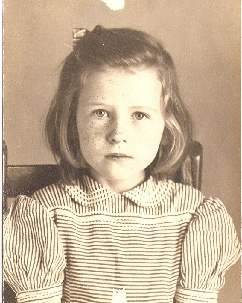
Grandma Virginia, apx. 1944 in North Carolina

Grandma Liliana, apx. 1942 in Rome, Italy
I would not consider myself a Photoshop expert. While I’m very proficient with Lightroom and many workflows in Photoshop, I had never tried to colorize a photo before. These are two very different photos, as well. The photo of Grandma Virginia is sepia toned and damaged. The photo of Grandma Liliana looks like an artist added to it (very common in old portraits), so it doesn’t look quite as photographic. But both photos would be fun to colorize. Here’s what I did.
How This Works
Let’s take a moment and just disregard color. Color is not necessary for photography. Black-and-white photos don’t look unnatural to us. Think about that. Your mind completely accepts black-and-white photography. Your wonderful brain will fill in the colors you think are there, or will just appreciate the artistry of a black-and-white image. We see it, think nothing of it, and move on.
But what is absolutely necessary for a photograph is contrast. Without contrast, we don’t know what are shadows, what are highlights, and the gradient and relationship between the two. As long as you have contrast, you can add color.
Grandma Virginia
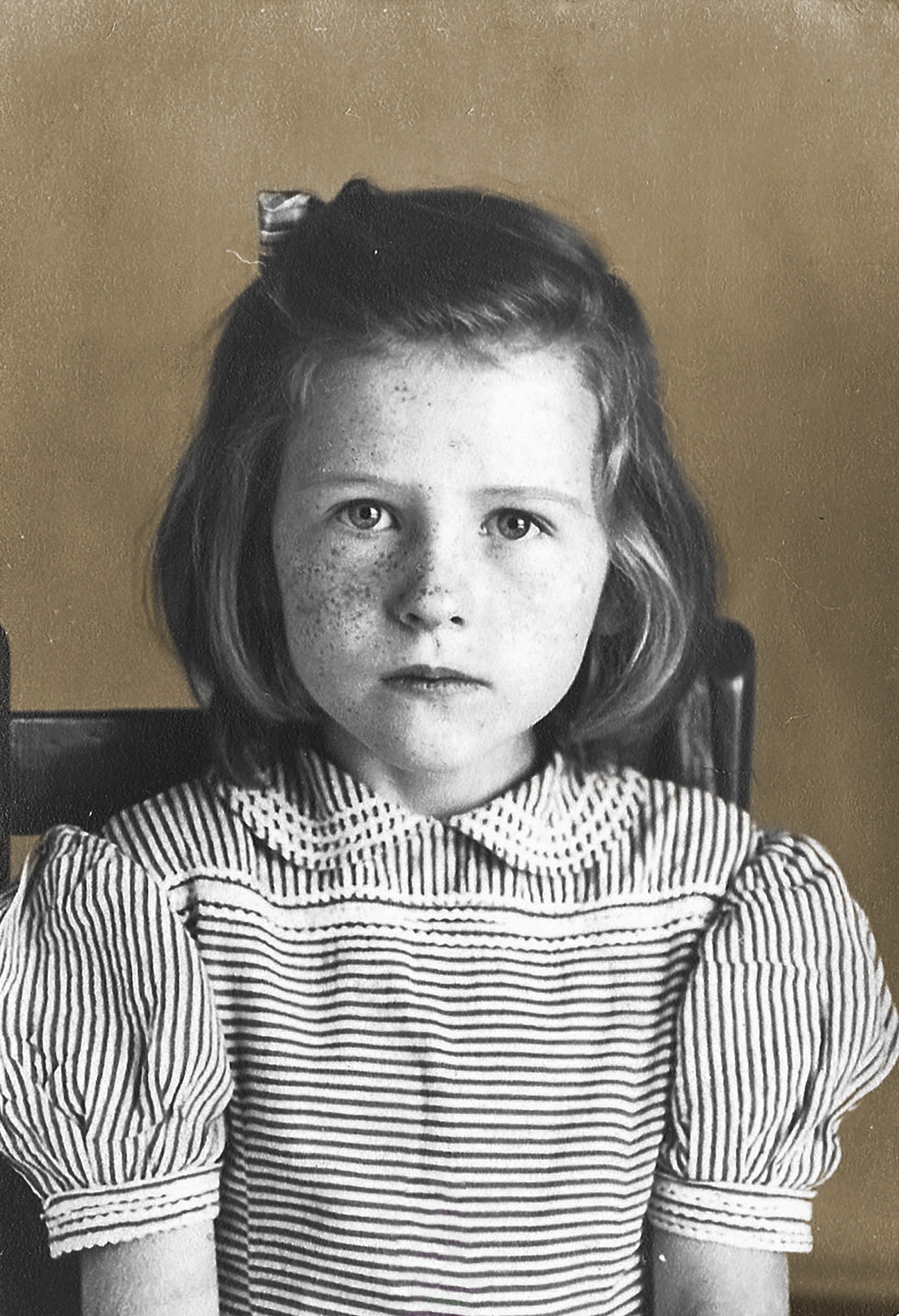
The first thing I did was make it a true black-and-white photo (removing the sepia color), and patching the damaged part of the photo.


Now that we have a halfway decent repaired black-and-white photo, we’re ready for the next step.
For this step, we need to think about all of the elements that will need color. There’s her shirt, her skin, her hair, her hair-bow, her lips, her eyes, the chair, and the background. Each of these things will need their own mask in Photoshop. To make that mask, simply make a new layer mask for each item and brush it. I don’t think you need to overthink how refined this is. You can use the “refine edges” tool in the mask to assist you if you need to.

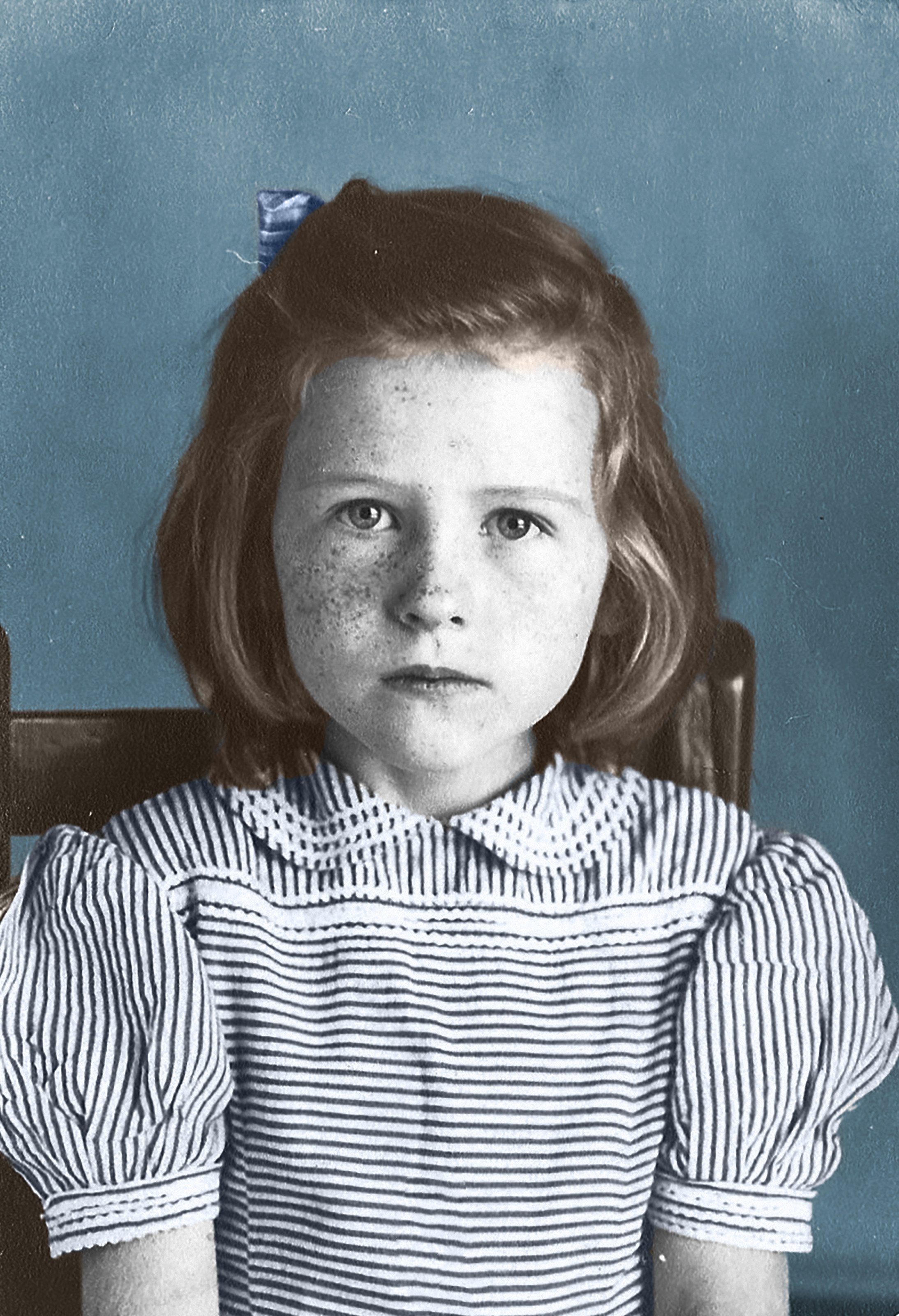
Once you’ve created a mask for each element, you’re going to need a color to overlay on that mask. Once you choose a color, you simply use the “Color” blending option. Since I don’t know some of the colors in the photo, like the backdrop or her shirt stripes, I can pick what I want or what I think goes well with the entire image.

I chose this blue because I think it’s realistic, and will compliment the other colors in this photo that I will apply. As an alternative, I also included a gold so you can see how simple it is. I did this so you can see how the contrast of this photo comes through, keeping the lighting nuances that are in the original black-and-white. Now let’s keep going and adding color to the rest of the photo using this same technique - mask, brush, color blend.

Now it’s time to colorize her face. Remember, there is already contrast there, and color will saturate according to the contrast. Darker areas will have more color, lighter areas have less. We’re just going to add a skin tone to her skin layer, a shade of red to her lips, and overlay green on her eyes. Fun fact: I have my grandmothers green eyes.


You can see it’s really coming along. I used the color pallet to the right because those colors felt the best. Your milage may differ if you try this yourself. Screenshot this section and copy these colors using the eye-dropper in Photoshop if you’d like.
The last thing we need to do is some overall photo tweaks, like the overall contrast, curves, and saturation. Once I made a few tweaks, I ended up with this final image.

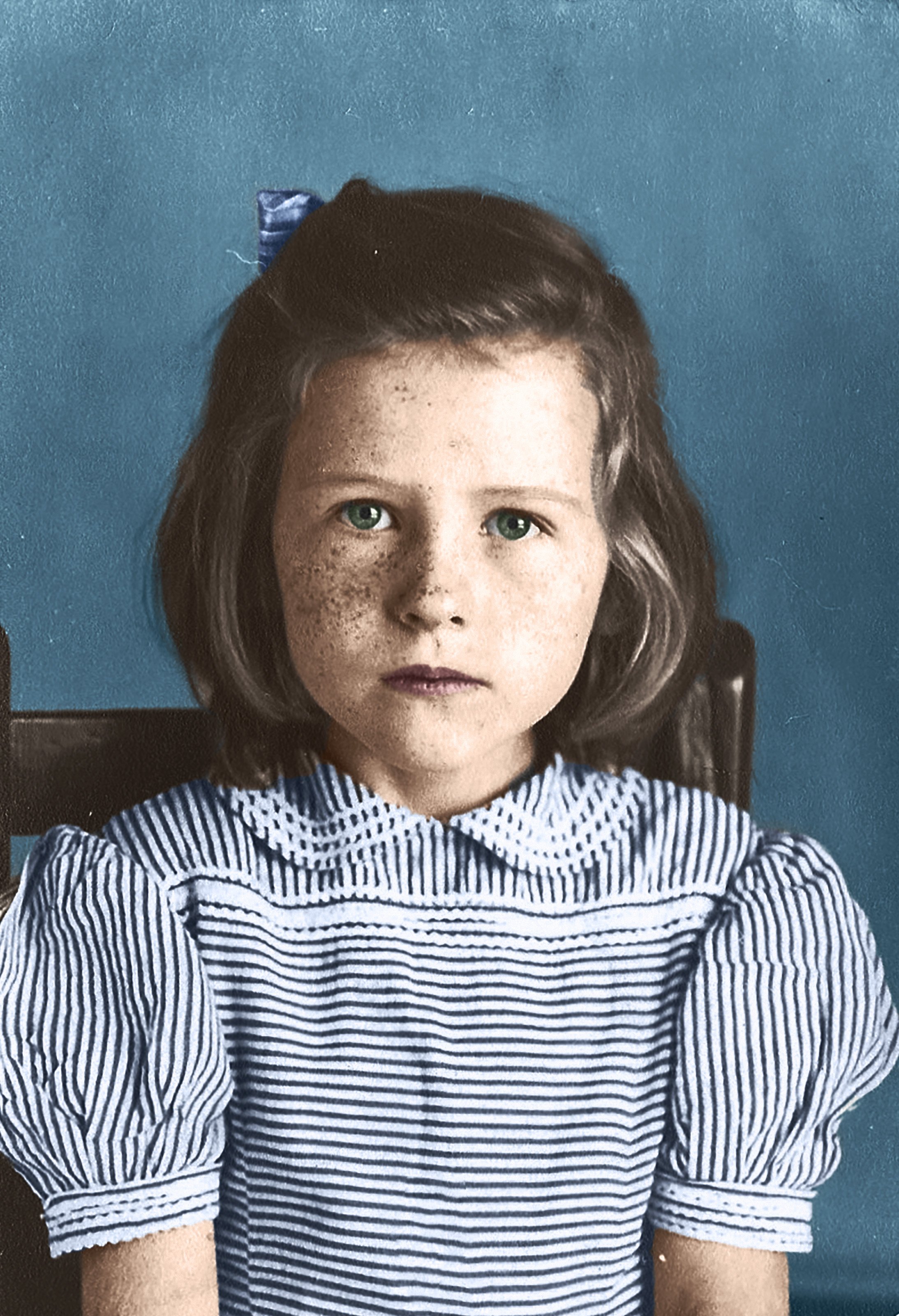
Is it perfect? Absolutely not. But it does bring a fresh perspective to this moment in the past.
Grandma Liliana
Just like before, I went ahead and removed the slight sepia tone that was over her photo so we have a true, colorless image.
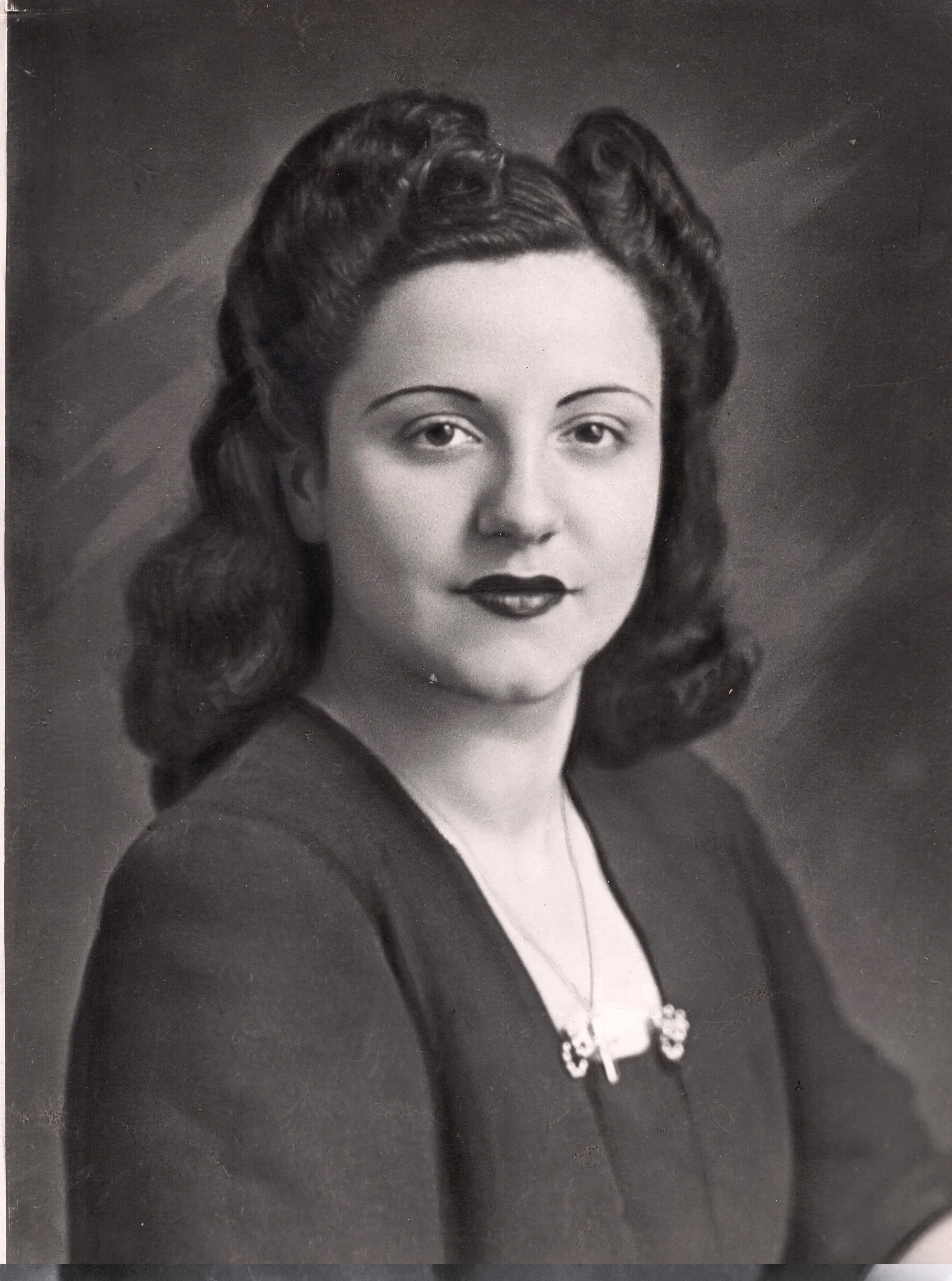
For this image, I have to color the backdrop, her shirt, her hair, her skin, her eyes, and her lips. Since she is from Rome, I did chose a bit of a different color pallet than with my other grandmother. I went with more olive skin, and more saturated colors. I also darkened her hair, since it was jet-black. And same as before, I applied the mask and brushed the elements.

Now it’s time for the skin tone, eyes, and lips. I figured, knowing my grandmother, that she was wearing very vibrant lipstick. She also has dark brown eyes, so I didn’t make much of a change to them.


Once I was finished overlaying the color, I made a few adjustments to further soften the image (since it’s likely had a painter soften it originally). I really like how it turned out.


Final Thoughts
This was actually much easier than you would think. While I did this at a very basic level, there are people you can follow this do this meticulously and beautifully, like History Colored. If you have some old black-and-white photos of your family sitting around (and you have Photoshop), you should give this a try. And if you do, let me know how it turns out!